

Project Notebook #5 – A Dramatic Kitchen and Family Room Remodeling and Addition
For most of the time that Eric and Christine had raised their family in this home, it did what they needed it to do. But now, with adult children around, everything just seemed to have gotten smaller, and everything seemed out of date. The family room wasn’t really connected to the kitchen, and the kitchen wasn’t close to big enough for everyone.
Tip: Check out this project’s portfolio page for “before and after” photos.
The house also had a screened porch that no one ever seemed to use, partly because of central Ohio’s humid summers, and partly because the views to the back weren’t attractive.
And that’s where this project began – with a desire to update the look of the kitchen, increase the size of the kitchen, add family room space, open all the spaces to each other, add lots of light, create new outdoor living spaces…and do it all while avoiding views of the backyard from inside.

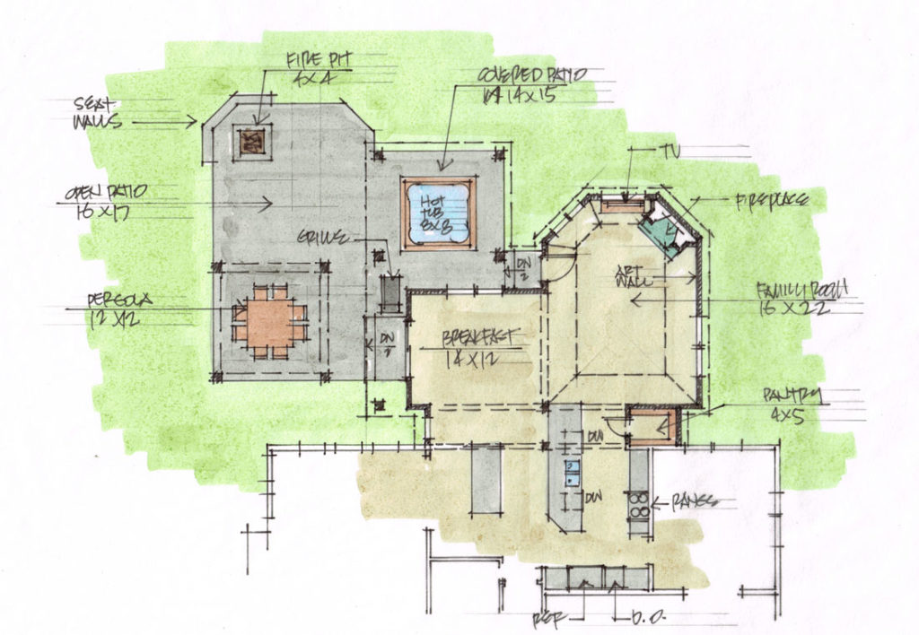
Above is the first floor plan we started with. In plan view, it looks like a pretty big breakfast room, but look how it’s right in the middle of the main traffic pattern through the house, and blocks any connection between the kitchen and living room.
The screened porch is in a pretty awful spot, too – you have to squeeze around the breakfast table to get there, and it blocks any light that might get through the one tiny window in the back wall.
I came up with a bunch of different ideas to fix this design, all of them involved reusing the existing kitchen, re-purposing part of the breakfast room, removing the awkward bay window and screened porch, and adding new space. Three of my early concepts are below:
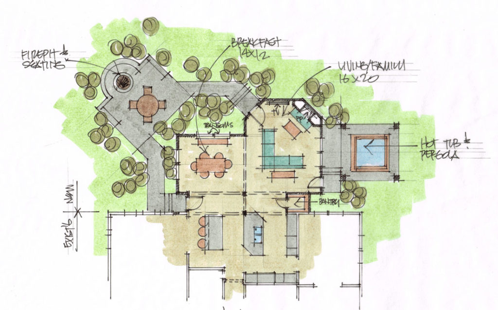
“Concept A” reoriented the kitchen island 90 degrees, and added a second island in what used to be the breakfast room. To make the roof connections and structure easier, I created a narrow “transition space” between the existing house and the new rooms. The transition space gave us a place for a door to the outside, and created a perfect spot for a new walk-in pantry.
New outdoor space includes a hot tub covered by a pergola; a large patio with space for outdoor dining; and a fire pit with built-in seating.
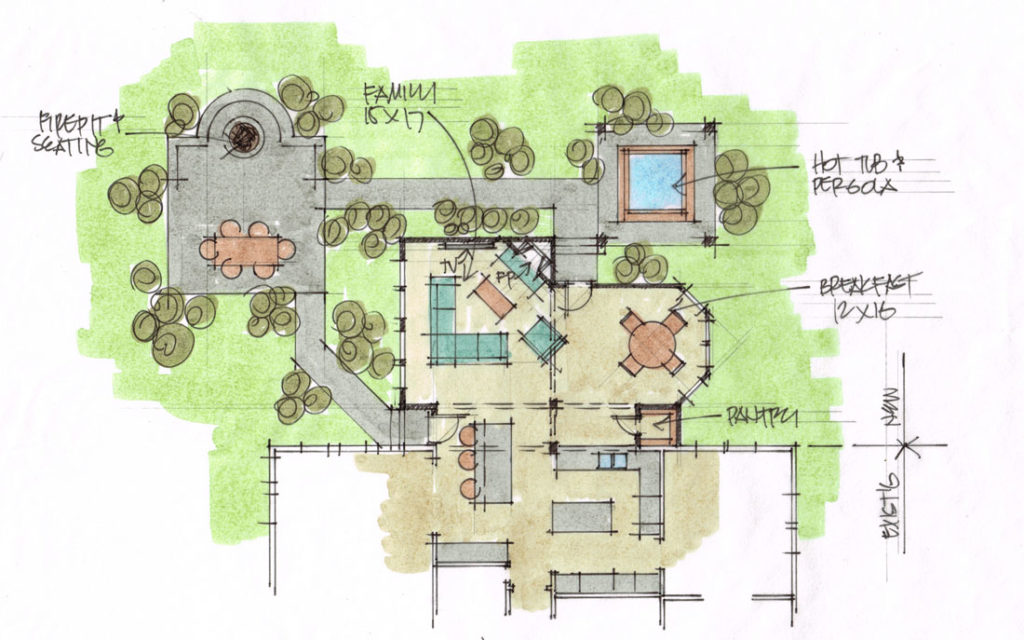
“Concept B” did some of the same things as “A”, but flipped over – the breakfast area’s on the right, the new family room on the left. In this plan, the kitchen layout stays more or less the same as it was originally.
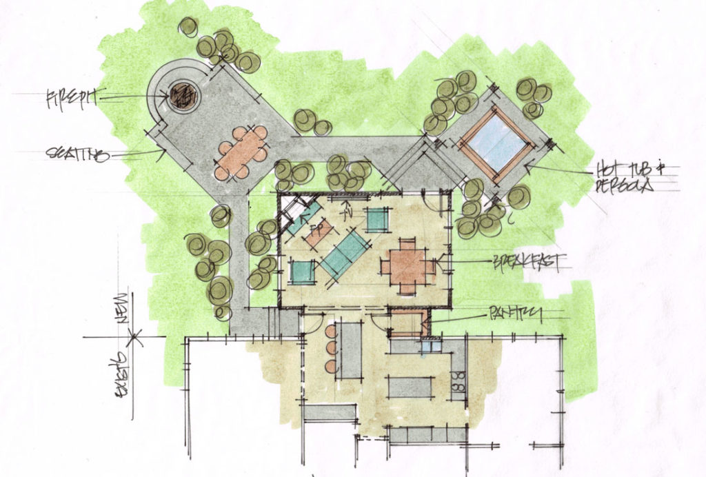
“Concept C” is a much more compact version of the previous two – the transition space is the same, but the rest of the addition is a simple rectangle. The kitchen didn’t really change in this version – one of the reasons this plan was rejected.
We ended up choosing “Concept A” as the starting point for the new design – a later, updated version of it is below. We’ve made a few big changes – most of the changes from the original concept plan are in the location of the hot tub, patio, and fire pit.
But making a final decision about a project as big as this one should never be made based on floor plans alone – I want to be sure my clients have a very good idea of how the spaces feel from the inside. Below are a few of the 3D sketches I did to show Eric and Christine what their remodeled house might really be like:
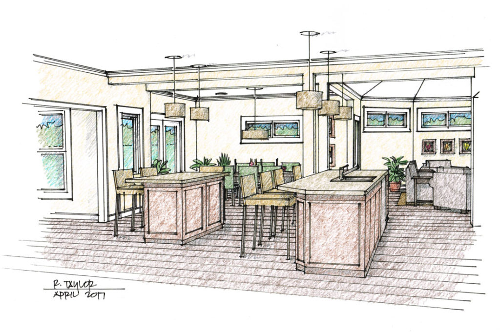
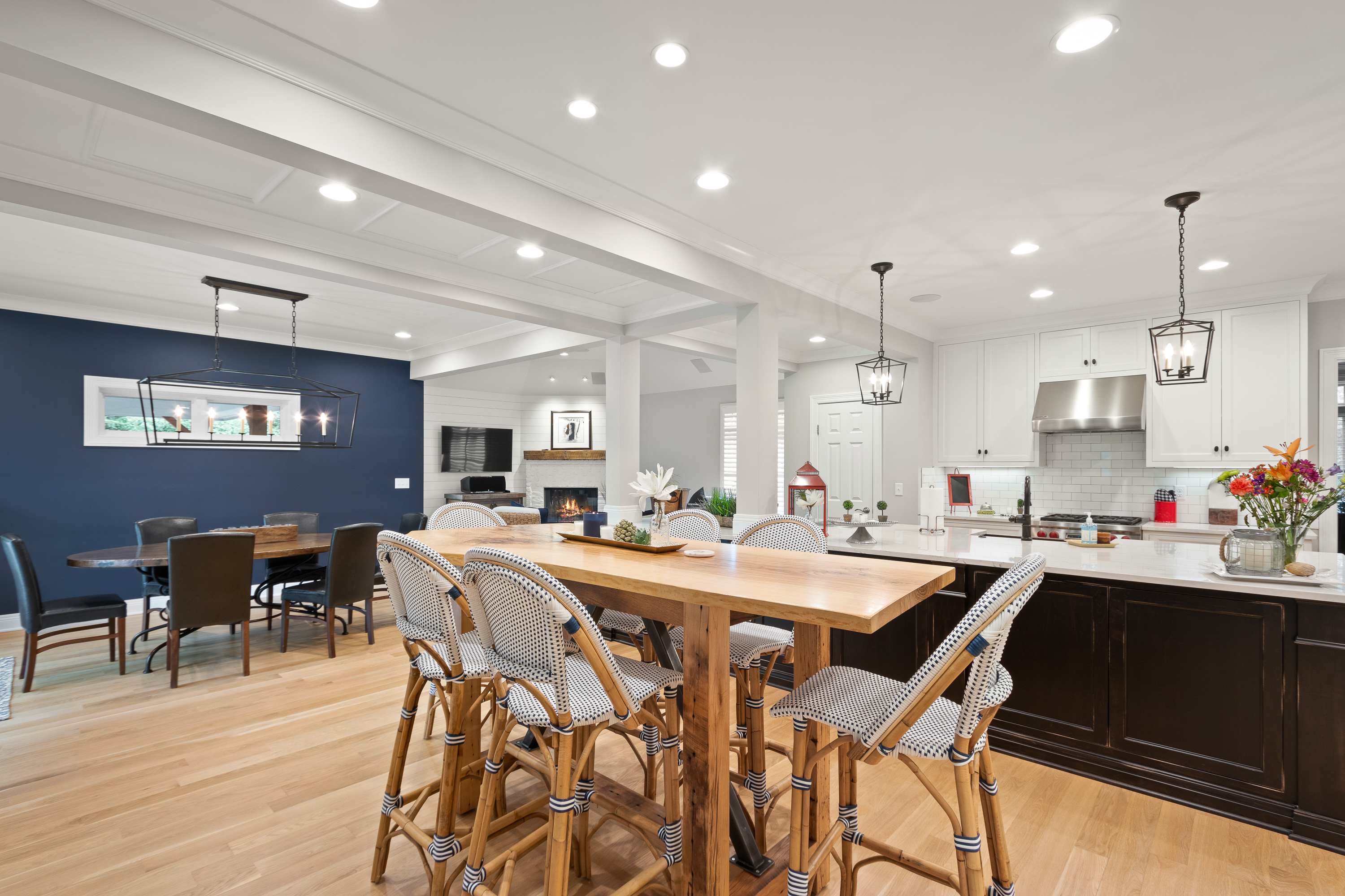
The view above is from inside the existing kitchen, looking out to the new breakfast area on the left, and the new family room on the right. Again, one of the goals here was opening spaces to each other. See the “transom” windows in the breakfast room and family room? Some of those were kept, and some we took out of the final design.
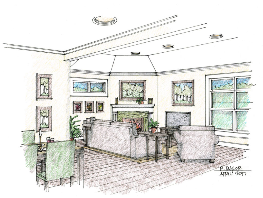
This view is from the “transition space” looking back into the new family room. The large windows to the right let in lots of light, but don’t have views of the backyard. The raised ceiling gives the family room just the right volume for its size.
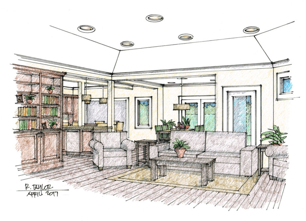
From inside the new family room, looking back towards the new breakfast area and into the expanded kitchen.
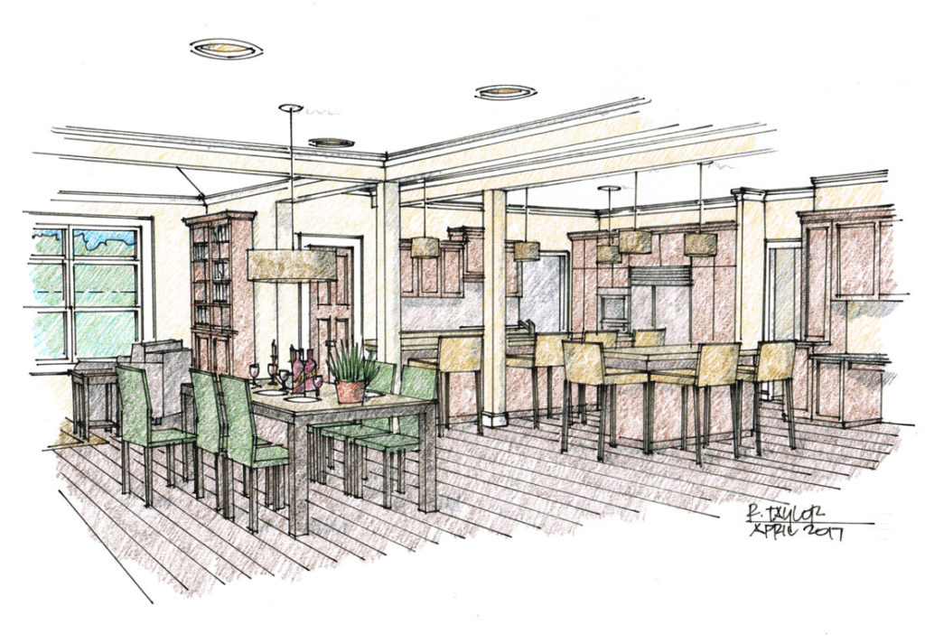
Above – looking into the expanded kitchen from the new breakfast area. One of the two columns in the transitional space is real and supports a beam that holds up the existing back wall of the house. The other post is “faux”, to create balance and symmetry.
3D sketches like these help everyone understand the design, and help my clients give better feedback. For example, these sketches helped them decide not to keep a wood finish on the cabinets. What did they end up doing? Check out the “before and after” photos on the portfolio page to find out!

Contact me to learn more about the services I offer and how I can help make your new home or remodeling project exciting, valuable and unique.
I love your ideas and especially the Maxwell Way project. It is somewhat similar to our situation with dining/living and kitchen space however we are in California on the Central Coast with very tight lots and coastal commission regulations. We will meet with a local architect to see what we can do to increase our dining space from 7×9. I hope he’s as talented as you.
Enjoying your blog and I feel like I’m excited to learn at 62, as much as I did when started college. Thank you
Jean – thanks so much for your kind comments! I have my fingers crossed that you find the right Architect for your project! 🙂